All-Cause-Mortality (ACM) as of November 2022
All-Cause-Mortality (ACM) has continued to run in excess amounts of 10 to 20% in most Western nations all throughout 2022, just as it did throughout all of 2021. Do you trust the official ‘vx saved 20 million lives’ based on ‘would have been worse’ models (made by the same people whose models were found to be 10-100 times off for the past 2.5 years)? Or would common sense say that ACM should get better if the measures taken (lockdowns, masks, jabs) were working? My interpretations may be off here, but how can every metric across multiple countries show everything is worse now than ever, and yet people still trust the narrative? I predict this will have an outcome I felt would happen back in 2020 – that this will simply lead to removal of statistics, data, and any info that goes against the MSM storyline. It is almost like they are taunting us by having us confirm their own data for them.
Here are just a few of the ACM notes and links that illustrate this. Some are direct data/graphs straight from official sites, and some are interpretations/summaries done by others. Still, they show a huge signal that no one is discussing beyond ‘long Covid’ or ‘people drop dead all the time’. These excess amounts are not covered by C19 or overdoses or any other cause in the news – they still remain ‘unknown’. It seems this is now the new acceptable level of mortality – the public is not even curious.
Between Ben @USMORTALITY and ‘OS51388957’ (and many others), you can find charts and summaries for almost any nation and their ACM versus the long term averages.
Sweden vs the Nordics. First off, revisiting the whole ‘Sweden failed because their Scandinavian neighbours had less C19 deaths’ storyline. This was popular in 2020 when people were glued to the ‘deaths with a +ve C19 test’ dashboards. By 2021 analysis moved on to ACM since the ‘death with a +ve C19 tests’ was clearly skewing the data. Now we have the (almost) 3 year follow up, to compare Sweden to itself and its neighbours for ACM from the 2013-2019 average through to the 2020-2022 years. This data and data for most of the EU is well-summarized by “OS51388957”.


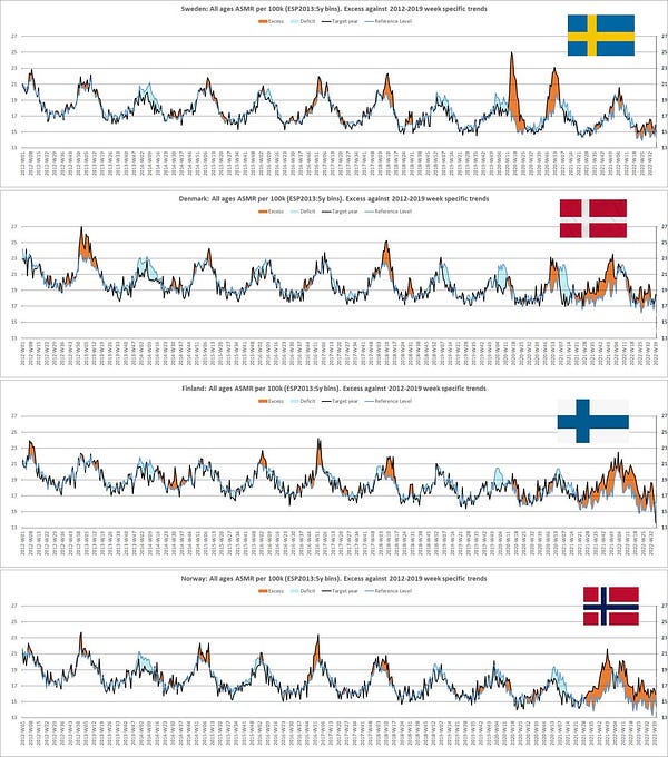

Whatever was done, Sweden took the ‘hit’ in 2020 (after an abnormally-low 2019 ACM year) and averaged-out to be normal, while the others took their ‘hit’ later, and all averaged-out to be similar. Typically, anything within +/-5% for ACM in any given year-over-year change is considered statistically-insignificant.
Ben at USMORTALITY arrives at a similar summary for the Nordics:
(* 2022 not complete as of Nov 2022)


Europe in general – most countries showing continued, elevated ACM all through 2022, even in summer months when C19 is not contributing to ACM as much. OS again has a running-summary of charts. But you can also look straight to the EUROMOMO (European Mortality Monitoring) site to see the same trend as others – 2022 and late 2021 are as bad or worse than 2020 during the ‘pandemic’.
All-ages – 2022 on track to be as bad as 2020 and 2021. This is excess mortality. The countries tallied here make up most of the EU, maybe 95% of the total, or about 420 million people. Mortality is roughly 0.85% (depending on age of population), meaning about 3.4 million deaths per year. So 350k excess (like below) is roughly a 10% increase.
What makes 2021-2022 worse is that now the cumulative excess among younger people is worse, compared to mostly elderly excess in 2020:
A summary from Jose Gefaell shows the breakdown:
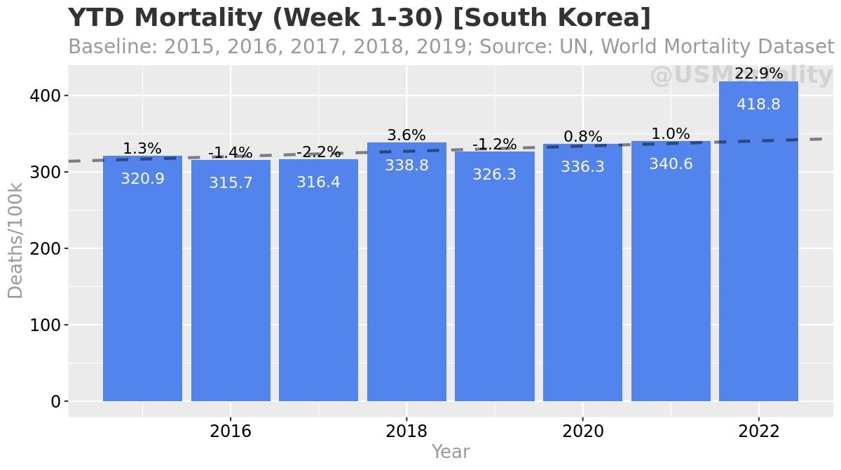
South Korea. The masks are working well there. Summary from Jose Gefaell:
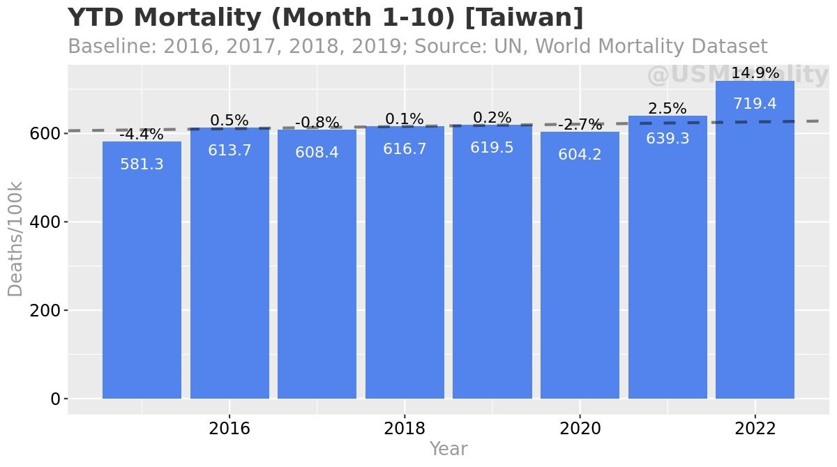
Taiwan is similar to Korea (most other Asian nations don’t publish their data to the public). From Ben @USMORTALITY:
Canada. You can get the trends straight from the STATSCAN site, although the data is delayed by 4 months depending on the Province. Still, most show continued excess throughout 2021 into 2022 even when C19 is not dominant.
If we zoom in to British Columbia as an example, we see continuous excess deaths of 10-15% for all Summer and longer for both 2021 and 2022. Roughly 700 people per week die during summer months, and 2021, 2022 are showing 800 per week, even without any heat wave (like in 2021).
USA. I still turn to Ethical Skeptic for the United States analysis. The ‘official’ toll is that C19 has killed 1.1 million (with a +ve C19 test). The ACM excess for the last 2.5 years has reached 1.3 million (typically 2.9 million Americans die each year, or 0.88%), so ACM is up approximately 18% over the 2.5 years from 2020 till November 2022.
From Ethical Skeptic
“A reminder, 977 K have died to date as result of our panic-solutions to the pandemic:
• 133 K overdose, accident, assault, suicide, etc.
• 401 K primarily Factor \/
• 443 K from denial of treatment
That is 76% of all pandemic excess death. Let that sink in...”
By his estimates, more than three-quarters of the excess over these 2.5 years is not C19, but the effects of locking down a (somewhat) healthy society, jabs, and common treatment denial due to the Emergency Use Authorization (needed to force the jabs and conduct the human trials). This leaves 24% of that excess chalked up to ‘involving’ C19 – meaning deaths for any reason with a positive test. Even that generous definition means 24% of the 1.3 million, or 300k deaths, over 2.5 years would be 125k deaths per year. (A ‘bad’ flu season in the US is typically around 50k deaths). (Note SAAAAD = suicide, addiction, assault, accident, abandonment, despair deaths).
Through the sites listed here, you can find almost any country and track its mortality trends. Most are just as bad or worse than the C19 wave of 2020, and most are not accounted for by C19 ‘deaths with a +ve test’. So if no one is investigating or reporting, instead just leaving these as ‘died suddenly’ or ‘unknown causes’, what are we left with?
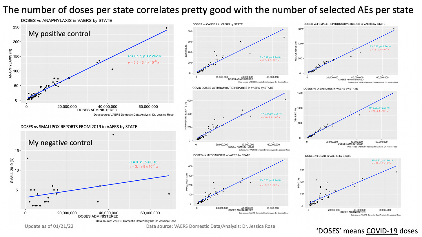
All countries now acknowledge and warn that the jabs are causing myocarditis and clots well above the background rate (normal rates). For detailed analysis on this, Jessica Rose has compiled chart after chart of adverse events from the jabs (also here). Are the VAERS reports all wrong? All fake? “Well anyone can make fake reports to VAERS”. The system is meant to be a signal-detector for jabs, and it’s putting up quite a loud signal for more than a year and a half.
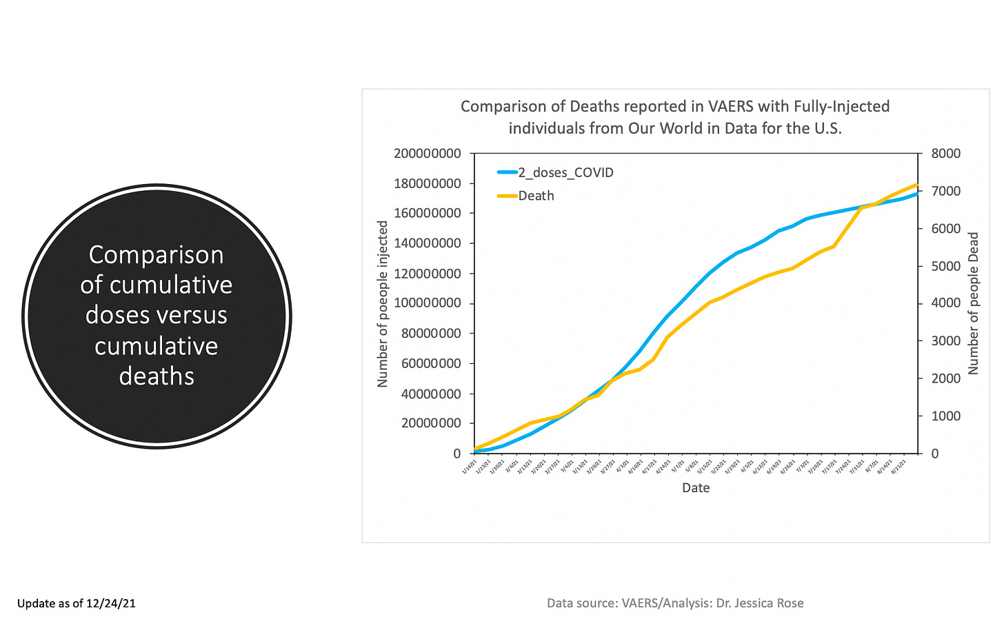
Here’s the cumulative VAERS deaths-post-jab as of a year ago – December 2021:
The death total as of November 2022 has now passed 32,000 with more than 180,000 hospitalizations. Is this really 5 or 10 times higher due to under-reporting? And if these were all ‘fake VAERS submissions – anyone can make one’, then how would the correlation of adverse events, by type, and by State rates of jabs per capita, have almost PERFECT correlation coefficients? People faking data would have to perfectly distribute across all reports for this. Rose provides a list of correlations here:
Does this have any relation to Norway and Denmark changing their guidance on jabs for those only 50 and older (or 65 and older for Norway)? Did they somehow acknowledge some sort of risk-reward by their changes? If so they still have set the bar quite high on the risk side. I wonder if they use different Science™ than we do in Canada or other countries that still insist on jabbing kids?
How many ‘correlation isn’t causation’ coincidences do people need? Or is this silence just them telling us this is it, “this is what we can now do to you people and no one will know or care”.


